
Week 8,9 and 10: Artist as Surveyor – Visualisation, Power and the Human Gaze in Post-Digital Space
- mrtnebusiness
- Mar 15
- 5 min read

Updated: Oct 2

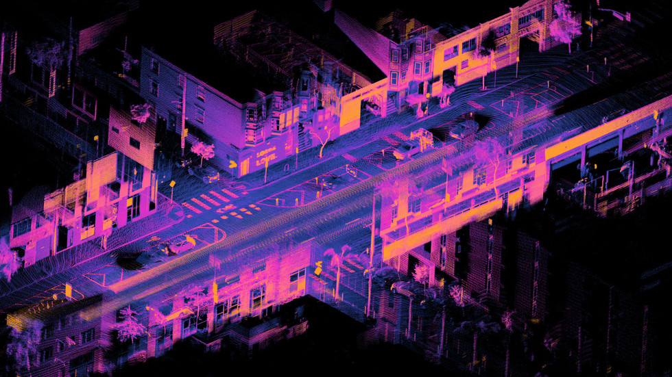
This week’s session, led by Steve Kennedy and Simon Withers of the Captivate Research Group, explored how artists and designers act as surveyors. They are not just observers of space, but interpreters who challenge how space is visualised, controlled, and remembered. Their work involves capturing historical and heritage sites using technology that claims to reveal what the human eye can not see. What became clear is that the human, our perspective, memory, and lived experience, remains central to how meaning is constructed. Without people, visualisation lacks truth.
This post reflects on the lecture, the readings, and my own notes. It considers how post-digital tools, spatial perception, and architectural compression shape not only our environments, but also how ethnic minority communities experience them.
Perspective as Power
In my notes from class, I wrote: “Le monde est vu sur différents angles – our perception changes it over time mais c’est nous qui décidons notre réalité.” This captured a key idea from the session: we do not passively observe the world, we shape it through how and what we choose to see.
The metaphor of the artist as surveyor asks us to reconsider tools like mapping, imaging, and data collection. These are not neutral. Withers reminded us that "to describe is to also not describe." Every act of surveying is selective, and every image leaves something out.
Kennedy’s idea of compression (2024) extends beyond digital processes. Compression also happens socially and politically. It is the act of reducing complexity, flattening diverse cultures, places, and emotions into something efficient or legible. Compressed environments may look clean, but often erase the layered realities of the people who live in them.
Scale, Symbolism, and the Limits of Vision
The readings by Joseph Addison and Alfred North Whitehead encouraged us to reflect on how we interpret images and spaces. Addison’s Pleasures of the Imagination (1712) links beauty to perception and distance, while Whitehead (1927) shows how we use symbols to simplify the world into manageable meanings. These ideas connect with Borges' story On Exactitude in Science, where a map becomes so detailed that it is no longer useful.
In the session, we discussed places like the Petrie Museum and Champonllion Street in Cairo. Withers pointed out that within a 100-metre radius, you might encounter ancient pyramids, desert, city towers, and colonial ruins. Each comes with its own aesthetic, political, and symbolic weight.
The film Powers of Ten (Eames and Eames, 1977), also referenced in the session, demonstrates how our understanding of space changes with scale. However, scale alone is not neutral. It depends on where we stand and how we are trained to look.
Architecture Needs People to Have Meaning
In my opinion, the post-digital world has made it clear that external architecture and internal elements would not survive without human input. Buildings, surfaces, and layouts are only meaningful when activated by memory, habit, emotion, and use.
Digital tools like 3D scanning, LiDAR, and AI-based rendering often claim to offer complete information. But they rarely consider the emotional or cultural realities of the people whose spaces are being recorded. Scholars such as Ruha Benjamin (2019) and Virginia Eubanks (2018) argue that technologies, when uncritically applied, often reinforce existing biases and social inequalities.
This matters deeply in relation to ethnic minority communities in the UK. Many of the environments we encounter from gentrified city centres to heritage-listed public parks have been designed with a specific audience in mind. As a result, spaces often feel curated for others, not for us.
Imposed Beauty and the Minority Experience
I believe that landscape architecture, especially when visualised through tools like renderings or flythroughs, imposes expectations on how ethnic minorities are meant to feel. The idea that a space is “calming” or “elevated” is usually based on white, Eurocentric aesthetic values.
My own experience supports this. I have walked through spaces that were meant to feel welcoming but instead felt curated and exclusionary. This links to Sara Ahmed’s (2014) concept of affective economies, the idea that emotion sticks to objects, people, and spaces. When you are not reflected in the vision of a space, it can create discomfort, even if the design is technically “good.”
Designers like Darren Sears (2024) admit that even well-meaning attempts to beautify landscapes often carry unintended political consequences. To define beauty is also to define what is not beautiful, and who does or does not belong.
Topography, Emotion, and Absence
In my notes, I referenced a quote from Elissa Rosenberg’s work on the topographic imagination: “The ground plane was tipped to accentuate the perspectival effect.” This highlights how shifts in elevation or sightlines are not just visual, but emotional. Perspective frames experience.
Simon Withers discussed the idea that "void equals absence equals architecture." This was a powerful reminder that what is missing from a space can be just as meaningful as what is present. In post-digital design, we are often encouraged to “fill” space with data and clarity. But sometimes what is needed is ambiguity, reflection, or rest.
As a designer interested in marginalised perspectives, I believe we must design for multiplicity. One space must accommodate many readings, not a singular narrative. We should build for memory, not just function.
Conclusion: Resisting Compression in a Post-Digital Age
This session reminded me that to survey is to frame, and to frame is to choose. Whether using technology, drawing, or mapping, we define the world through our lens. In the post-digital era, that lens is powerful, but it must also be critical and self-aware.
As someone working between art and architecture, I do not believe in neutrality. I believe in responsibility. Compression, as Kennedy writes, simplifies. But good design should expand, making room for complexity, contradiction, and cultural truth.
My work aims to resist visual flattening and create spaces that speak across time, emotion, and identity. I want my outcomes to feel lived-in, not just designed.
References
Addison, J. (1712) ‘The Pleasures of the Imagination’, The Spectator, No. 420. Available at: https://anthologydev.lib.virginia.edu/work/Spectator/addison-spectator-420 (Accessed: March 2025).
Ahmed, S. (2014) The Cultural Politics of Emotion. 2nd edn. Edinburgh: Edinburgh University Press.
Benjamin, R. (2019) Race After Technology: Abolitionist Tools for the New Jim Code. Cambridge: Polity Press.
Eames, C. and Eames, R. (1977) Powers of Ten [Short Film]. Available at: https://www.youtube.com/watch?v=0fKBhvDjuy0 (Accessed: March 2025).
Eubanks, V. (2018) Automating Inequality: How High-Tech Tools Profile, Police, and Punish the Poor. New York: St. Martin’s Press.
Kennedy, S. (2024) Compression Mode: The Edge of Sensibility. London: [Publisher].
Rosenberg, E. (2002) The Topographic Imagination. Journal of Landscape Architecture, May, pp. 21–37.
Sears, D. (2024) ‘From Landscape Architecture to Art’, Public Design Review, Spring.
Whitehead, A. N. (1927) Symbolism: Its Meaning and Effect. London: Macmillan. Available at: https://archive.org/details/in.ernet.dli.2015.166010/page/n11/mode/2up (Accessed: March 2025).
Comments